


This post is meant to serve as a quick CSS reference. We list the most commonly used classes and their usage.
CSS Selectors
Select the HTML element to style them. Five categories of Selectors:
- Simple – based on name, id, class
- Combination – based on a specific relationship between them
- Pseudo-class – based on a certain state
- Pseudo-elements – select and style a part of an element
- Attribute – based on an attribute or attribute value
The CSS element Selector uses the element name to select & style HTML elements.
p {
  text-align: center;
  color: red;
}
The CSS id Selector uses the id attribute(#) of an HTML element.
#para1 {
  text-align: center;
  color: red;
}
The CSS class Selector uses specific class attribute(.) to select.
p.center {
  text-align: center;
  color: red;
}
The CSS Universal Selector (*) selects all HTML elements on the page.
* {
  text-align: center;
  color: blue;
}
The CSS Grouping Selector styles multiple HTML elements similarly (with the same style definitions).
h1, h2, p {
  text-align: center;
  color: red;
}
CSS Colors
CSS Color Names can be specified by using a color name:
- Tomato
- Orange
- DodgerBlue
- MediumSeaGreen
- Gray
- SlateBlue
- Violet
- LightGray
CSS/HTML support 140 standard color names.
CSS RGB Color:
The color can be specified by setting up the color parameters (RGB value).
rgb(255, 0, 0)
CSS HEX Colors:
The color can be specified using a hexadecimal value like #rrggbb Where rr (red), gg (green) and bb (blue) are hexadecimal values between 00 and ff (same as decimal 0-255).
CSS HSL Colors:
The color can be specified using hue, saturation, and lightness (HSL) in the form: hsl(hue, saturation, lightness)
Parameters:
- Hue: degree value from 0 to 360. 0 is red, 120 is green, and 240 is blue.
- Saturation: percentage value, 0% is a shade of gray, and 100% is the full color.
- Lightness: percentage value, 0% is black, 50% is neither light or dark, 100% is white.
CSS Background
Backgrounds are used to define background effects for elements.
There are five background properties:
- color
- image
- repeat
- attachment
- position
background-color specifies the background color of an element.
body {
  background-color: lightblue;
}
A color is most often specified by valid color name, HEX, RGB value.
background-image: specifies an image. Basically the image is repeated so it covers the entire element.
body {
  background-image: url("pen.gif");
}
background-repeat: limits the repeating of the background-image property horizontally and vertically.
body {
  background-image: url("gradient_bg.png");
  background-repeat: repeat-x;
}
background-repeat: no-repeat; shows the background image only once.
body {
  background-image: url("img_animal.png");
  background-repeat: no-repeat;
}
background-position: specify the position of the background image.
body {
  background-image: url("img_animal.png");
  background-repeat: no-repeat;
  background-position: right top;
}
background-attachment: specifies whether the background image should scroll or be fixed.
body {
  background-image: url("img_tree.png");
  background-repeat: no-repeat;
  background-position: right top;
  background-attachment: fixed;
}
CSS Borders
Border properties allow us to specify the style, width, and color of an element’s border.
Border Style: specifies what kind of border to display. The following values are allowed:
dotted - Defines a dotted border
dashed - Defines a dashed border
solid - Defines a solid border
double - Defines a double border
groove - Defines a 3D grooved border. The effect depends on the border-color value
ridge - Defines a 3D ridged border. The effect depends on the border-color value
inset - Defines a 3D inset border. The effect depends on the border-color value
outset - Defines a 3D outset border. The effect depends on the border-color value
none - Defines no border
hidden - Defines a hidden border
Border-Style property can have four values -top border, right border, bottom border, and the left border.
p.dotted {border-style: dotted;}
p.dashed {border-style: dashed;}
p.mix {border-style: dotted dashed solid double;}
Border Width: specifies the width of the four borders. The width can be set as a specific size (in px, pt, cm, em, etc) with three predefined values: thin, medium, or thick:
p.one {
  border-style: solid;
  border-width: 5px;
}
Specific Side Widths:
p.one {
  border-style: solid;
  border-width: 5px 20px; /* 5px top and bottom, 20px on  the sides  */
}
Border Color: sets the color of the four borders.
We can set color by name, HEX, RGB, HSL, transparent.
p.one {
  border-style: solid;
  border-color: red;
}
Using specific color name
p.one {
  border-style: solid;
  border-color: red green blue yellow;    /* red top, green right, blue bottom and yellow left */
}
Using HEX values
p.one {
  border-style: solid;
  border-color: #ff0000; /* red */
}
Border Sides:
Border – Individual Sides: used to specify a different border for each side(top, right, bottom, and left).
p {
  border-top-style: dotted;
  border-right-style: solid;
  border-bottom-style: dotted;
  border-left-style: solid;
}
If the border-style property has 4 values: border-style: dotted solid double dashed;
- top border is dotted
- right border is solid
- bottom border is double
- left border is dashed
If it has 3 values: border-style: dotted solid double;
- top border is dotted
- right and left borders are solid
- bottom border is double
If it has 2 values: border-style: dotted solid;
- top and bottom borders are dotted
- right and left borders are solid
If it has only 1 value: border-style: dotted;
- all four borders are dotted
Rounded Borders: border-radius property is used to add rounded borders to an element:
- Normal border
- Round border
- Rounder border
- Roundest border
p {
  border: 2px solid red;
  border-radius: 5px;
}
CSS Margins
Margins are used to create space around elements, outside of any defined borders.
Margin – Individual Sides:
margin-top
margin-right
margin-bottom
margin-left
The margin properties having following values:
- auto – the browser calculates the margin
- length – specifies a margin in px, pt, cm, etc.
- % – specifies a margin in % of the width of the containing element
- inherit – specifies that the margin should be inherited from the parent element
Negative values are allowed.
p {
  margin-top: 100px;
  margin-bottom: 100px;
  margin-right: 150px;
  margin-left: 80px;
}
Margin – Shorthand Property: To shorten the code, it is possible to specify all the margin properties in one property. The margin property is a shorthand property for the following individual margin properties:
margin-top
margin-right
margin-bottom
margin-left
If the margin property has 4 values: margin: 25px 50px 75px 100px;
- top margin is 25px
- right margin is 50px
- bottom margin is 75px
- left margin is 100px
p {
  margin: 25px 50px 75px 100px;
}
The auto Value: can set the margin property to auto to horizontally center the element within its container.
div {
  width: 300px;
  margin: auto;
  border: 1px solid red;
}
The inherit Value: Elements can be inherited always from the parent element. Use the inherit Value:
div {
  border: 1px solid red;
  margin-left: 100px;
}

p.ex1 {
  margin-left: inherit;
}
Margin Collapse: Top and bottom margins of elements are sometimes collapsed into a single margin. This does not happen on left and right margins! Only top and bottom margins.
h1 {
  margin: 0 0 50px 0;
}

h2 {
  margin: 20px 0 0 0;
}
CSS Padding
Generate space around an element’s content, inside of any defined borders – top, right, bottom, and left.
Padding – Individual Sides: Values of Padding Properties can be in length, %, or inherit. Negative values are not allowed.
div {
  padding-top: 50px;
  padding-right: 30px;
  padding-bottom: 50px;
  padding-left: 80px;
}
Padding – Shorthand Property:
To shorten the code, it is possible to specify all the padding properties in one property.
div {
  padding: 25px 50px 75px 100px;
}
Padding and Element Width: It specifies the width of the element’s content area. The content area is the portion inside the padding, border, and margin of an element (the box model).
div {
  width: 300px;
  padding: 25px;
}
By using the box-sizing property:
div {
  width: 300px;
  padding: 25px;
  box-sizing: border-box;
}
CSS Height and Width
CSS Setting height and width: Do not include padding, borders, or margins. It sets the height/width of the area inside the padding, border, and margin of the element.
Values of the height and width properties:
auto - This is default. The browser calculates the height and width
length - Defines the height/width in px, cm etc.
% - Defines the height/width in percent of the containing block
initial - Sets the height/width to its default value
inherit - The height/width will be inherited from its parent value
div {
  height: 200px;
  width: 50%;
  background-color: powderblue;
}
Setting max-width: used to set the maximum width of an element. Can be specified in length values, like px, cm, etc., or in percent (%) of the containing block, or set to none (this is default. Means that there is no maximum width). The value of the max-width property overrides width.
CSS Box Model
The CSS Box Model: All HTML elements can be considered as boxes. The CSS box model is essentially a box that wraps around every HTML element. It consists of: margins, borders, padding, and the actual content.
- Content – The content of the box, where text and images appear
- Padding – Clears an area around the content. The padding is transparent
- Border – A border that goes around the padding and content
- Margin – Clears an area outside the border. The margin is transparent
div {
  width: 300px;
  border: 15px solid green;
  padding: 50px;
  margin: 20px;
}
Width and Height of an Element:
div {
  width: 320px;
  padding: 10px;
  border: 5px solid gray;
  margin: 0;
}
CSS Outline
A Line is drawn around elements, OUTSIDE the borders, to make the element “stand out”.
outline-style
outline-color
outline-width
outline-offset
outline
Outline Style: It specifies the style of the outline, and having following values:
dotted - Defines a dotted outline
dashed - Defines a dashed outline
solid - Defines a solid outline
double - Defines a double outline
groove - Defines a 3D grooved outline
ridge - Defines a 3D ridged outline
inset - Defines a 3D inset outline
outset - Defines a 3D outset outline
none - Defines no outline
hidden - Defines a hidden outline
p.dotted {outline-style: dotted;}
p.dashed {outline-style: dashed;}
Outline Width: It specifies the width of the outline, having following values:
thin (typically 1px)
medium (typically 3px)
thick (typically 5px)
A specific size (in px, pt, cm, em, etc)
p.ex1 {
  border: 2px solid black;
  outline-style: solid;
  outline-color: red;
  outline-width: thin;
}
Outline Color: Used to set the color of the outline. The color can be set by name,HEX, RGB, HSL, invert.
p.ex1 {
  border: 2px solid black;
  outline-style: solid;
  outline-color: blue;
}
CSS Text
Used to set the color of the text. The color is specified by color name or HEX, RGB value.
body {
  color: blue;
}

h1 {
  color: green;
}
Text Color and Background Color:
body {
  background-color: lightgrey;
  color: blue;
}
h1 {
  background-color: grey;
  color: red;
}
Text Alignment
Text Alignment: Used to set the horizontal alignment of a text. A text can be left or right aligned, centered, or justified.
h1 {
  text-align: center;
}
When the text-align property is set to “justify”, each line is stretched so that every line has equal width, and the left and right margins are straight (like in magazines and newspapers).
div {
  text-align: justify;
}
Text Direction:
The direction and unicode-bidi properties can be used to change the text direction of an element.
p {
  direction: rtl;
  unicode-bidi: bidi-override;
}
Vertical Alignment: This property sets the vertical alignment of an element. To set the vertical alignment of an image in a text.
img1.top {
  vertical-align: top;
}
Text Decoration
Text Decoration: To set or remove decorations from text. The value text-decoration: none; is often used to remove underlines from links.
abc {
  text-decoration: none;
}

p1 {
  text-decoration: overline;
}

p2 {
  text-decoration: line-through;
}

p3 {
  text-decoration: underline;
}
Text Transformation:
This property is used to specify uppercase and lowercase letters in a text, or to capitalize.
p.uppercase {
  text-transform: uppercase;
}

p.lowercase {
  text-transform: lowercase;
}

p.capitalize {
  text-transform: capitalize;
}
Text Spacing: Text Indentation is used to specify the indentation of the first line of a text:
p {
  text-indent: 50px;
}
Letter Spacing: The letter-spacing property is used to specify the space between the characters in a text.
h1 {
  letter-spacing: 3px;
}

h2 {
  letter-spacing: -3px;
}
Line Height is used to specify the space between lines.
p.small {
  line-height: 0.8;
}

p.big {
  line-height: 1.8;
}
Word Spacing: is used to specify the space between the words in a text.
h1 {
  word-spacing: 10px;
}
White Space: This property specifies how white-space inside an element is handled.
p {
  white-space: nowrap;
}
Text Shadow: This property adds shadow to text. You only specify the horizontal shadow (2px) and the vertical shadow (2px).
h1 {
  text-shadow: 2px 2px;
}
Add color to the shadow:
h1 {
  text-shadow: 2px 2px red;
}
Add blur effect to the shadow:
h1 {
  text-shadow: 2px 2px 5px red;
}
CSS Fonts
Define the font family, boldness, size, and the style of a text. There are 2 types of font family,
- generic family – a group of font families with a similar look (like “Serif” or “Monospace”)
- font family – a specific font family (like “Times New Roman” or “Arial”)
- Serif – Times New Roman and Georgia – Serif fonts have small lines at the ends on some characters
- Sans-Serif – Arial and Verdana – “Sans” means without – these fonts do not have the lines at the ends of characters
- Monospace – Courier New and Lucida Console – All monospace characters have the same width
Font Family: The font-family property should hold several font names as a “fallback” system. If the browser does not support the first font, it tries the next font. Start with the font you want, and end with a generic family, to let the browser pick a similar font in the generic family, if no other fonts are available.
.serif {
  font-family: "Times New Roman", Times, serif;
}

.sansserif {
  font-family: Arial, Helvetica, sans-serif;
}

.monospace {
  font-family: "Lucida Console", Courier, monospace;
}
Font Style: This property has 3 values:
- normal
- italic
- oblique – The text is “leaning” / very similar to italic, but less supported
p.normal {
  font-style: normal;
}
Font Weight: This property specifies the weight of a font.
p.normal {
  font-weight: normal;
}

p.thick {
  font-weight: bold;
}
Font Variant: This property specifies whether or not a text should be displayed in a small-caps font. In a small-caps font, all lowercase letters are converted to uppercase letters. However, the converted uppercase letters appear in a smaller font size than the original uppercase letters in the text.
p.normal {
  font-variant: normal;
}

p.small {
  font-variant: small-caps;
}
Font Size: The font-size property sets the size of the text. The font-size value can be an absolute, or relative size.
Absolute size: Sets the text to a specified size. Does not allow a user to change the text size in all browsers (bad for accessibility reasons). Absolute size is useful when the physical size of the output is known
Relative size: Sets the size relative to surrounding elements. Allows a user to change the text size in browsers. Set Font Size With Pixels:
h1 {
  font-size: 40px;
}
Set Font Size With Em: To allow users to resize the text (in the browser menu), many developers use em instead of pixels. The default text size == 1em == 16px. pixels/16 = em
h1 {
  font-size: 2.5em; /* 40px/16=2.5em */
}
Responsive Font Size: The text size can be set with a vw unit, which means the “viewport width”. That way the text size will follow the size of the browser window:
<h1 style="font-size:10vw">Hello World</h1>
CSS Icons
The simplest way to add an icon to your HTML page, is with an icon library, such as Font Awesome. Add the name of the specified icon class to any inline HTML element (like or ). All the icons in the icon libraries below, are scalable vectors that can be customized with CSS (size, color, shadow, etc.)
Font Awesome Icons:
To use the Font Awesome icons, go to fontawesome.com, sign in, and get a code to add in thesection of your HTML page:
<script src="https://kit.fontawesome.com/yourcode.js"></script>
CSS Links
With CSS, links can be styled in different ways.
Styling Links: Links can be styled with any CSS property (e.g. color, font-family, background, etc.) Example:
a {
  color: hotpink;
}
In addition, links can be styled differently depending on what state they are in. The 4 links states are:
a:link - a normal, unvisited link
a:visited - a link the user has visited
a:hover - a link when the user mouses over it
a:active - a link the moment it is clicked
Example:
/* unvisited link */
a:link {
  color: red;
}

/* visited link */
a:visited {
  color: green;
}

/* mouse over link */
a:hover {
  color: hotpink;
}

/* selected link */
a:active {
  color: blue;
}
CSS Lists
HTML Lists and CSS List Properties: In HTML, there are two main types of lists:
- unordered lists (ul) – the list items are marked with bullets
- ordered lists (ol) – the list items are marked with numbers or letters
Different List Item Markers: The list-style-type property specifies the type of list item marker.
ul.a {
  list-style-type: circle;
}

ol.b {
  list-style-type: upper-roman;
}

ol.c {
  list-style-type: lower-alpha;
}
An Image as The List Item Marker: The list-style-image property specifies an image as the list item marker.
ul {
  list-style-image: url('sqpurple.gif');
}
Position The List Item Markers: This property specifies the position of the list-item markers (bullet points). “list-style-position: outside;” means that the bullet points will be outside the list item. The start of each line of a list item will be aligned vertically. “list-style-position: inside;” means that the bullet points will be inside the list item. As it is part of the list item, it will be part of the text and push the text at the start:
ul.a {
  list-style-position: outside;
}

ul.b {
  list-style-position: inside;
}
Remove Default Settings: The ‘list-style-type:none’ property can also be used to remove the markers/bullets. The list also has default margin and padding. To remove this, add ‘margin:0 and padding:0’ to ul or ol:
ul {
  list-style-type: none;
  margin: 0;
  padding: 0;
}
List – Shorthand property: The list-style property is a shorthand property. It is used to set all the list properties in one declaration.
ul {
  list-style: square inside url("sqpurple.gif");
}
CSS Tables
Table Borders: Border property is used to specify the table Borders in CSS.
table, th, td {
  border: 1px solid black;
}
Collapse Table Borders: The border-collapse property sets whether the table borders should be collapsed into a single border.
table {
  border-collapse: collapse;
}

table, th, td {
  border: 1px solid black;
}
Table Width and Height: Width and height of a table are defined by the width and height properties.
table {
  width: 100%;
}

th {
  height: 50px;
}
Horizontal Alignment: This property sets the horizontal alignment (like left, right, or center) of the content in th or td. By default, the content of th elements are center-aligned and the content of td elements are left-aligned.
th {
  text-align: left;
}
Vertical Alignment: This property sets the vertical alignment to the content th or td. The default vertical alignment of the content in a table is middle.
td {
  height: 50px;
  vertical-align: bottom;
}
Table Padding: This property is used to control the space between border and content in the table.
th, td {
  padding: 15px;
  text-align: left;
}

Horizontal Dividers: Border-bottom property is used for horizontal dividers.
th, td {
  border-bottom: 2px solid #fff;
}
Hoverable Tables: Use the hover selector to highlight the table rows.
Striped Tables: For zebra-stripes table, use nth- child selector.
CSS Table Properties:
- Border: Sets all the border properties in one declaration
- Border-collapse: Specifies whether or not table borders should be collapsed
- Border-spacing: Specifies the distance between the borders of adjacent cells
- Caption-side: Specifies the placement of a table caption
- Empty-cells: Specifies whether or not to display borders and background on empty cells in a table
- Table-layout: Sets the layout algorithm to be used for a table
CSS Layout
The display Property: This property specifies if/how an element is displayed. The default display value for most elements is block or inline.
Block-level Elements:
div is a block-level element and always starts with a new line.
h1-h6
p
form
header
footer
section
Inline Elements: No need to start on a new line and only takes up as much width as necessary.
span -  inside a paragraph.
a
img
Display: none: Used to hide and show elements without deleting and recreating them. The script element uses ‘display : none;’ as default.
span{
  display: block;
}

li {
  display : inline;
}
Hide an Element:
h1.hidden {
  display: none;
}

h1.hidden {
  visibility: hidden;
}
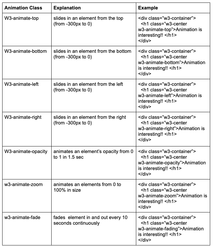
CSS Animation
W3.CSS is an alternative to the Bootstrap framework that is faster, easier and smaller. It is a modern, responsive, mobile-first CSS framework that works with Chrome, Firefox, Edge, Safari and Opera browsers. It is a CSS-only framework.
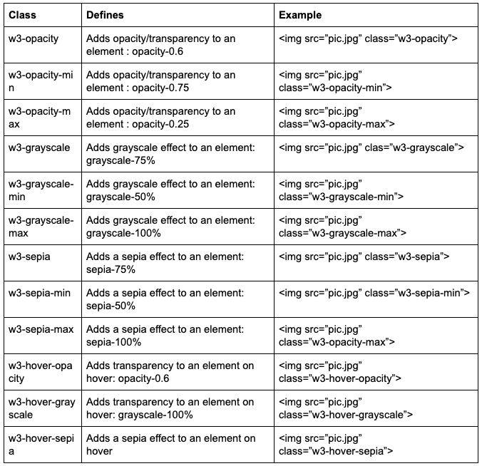
CSS Effects
CSS Bars
Horizontal Bar: w3-bar class is used to style
<div class=”w3-bar w3-red”>
<div class=”w3-bar-item”>Sam</div>
<div class=”w3-bar-item”>Jack</div>
<div class=”w3-bar-item”>Barbara</div>
Purpose of w3-bar-item: to provide correct spacing, padding, and positioning.
<div class=”w3-bar-block w3-red”>
<div class=”w3-bar-item”>Sam</div>
<div class=”w3-bar-item”>Jack</div>
<div class=”w3-bar-item”>Barbara</div>
</div>
CSS Dropdowns
w3-dropdown-hover: a hoverable dropdown element
w3-dropdown-content:  display dropdown part
w3-dropdown-click: a clickable dropdown element
CSS Accordions: are used to show or hide HTML contents. w3-hide class used to hide the content. Use a button to open and close the content.
CSS Navigation Bar
w3-bar: Horizontal container
w3-bar-block: Vertical container
w3-bar-item: Container bar elements
w3-sidebar: Vertical sidebar
w3-mobile: makes any bar element mobile first responsive
w3-dropdown-hover: Hoverable dropdown element
w3-dropdown-click: Clickable dropdown element
Basic Navigation: W3-bar class is a container for displaying HTML elements horizontally. W3-bar-item class defines the container elements.
<div class=”w3-bar w3-darkgray”>
  <a href=”#” class=”w3-bar-item w3-button”>HomePage</a>
  <a href=”#” class=”w3-bar-item w3-button”>Link1</a>
  <a href=”#” class=”w3-bar-item w3-button”>Link2</a>
</div>
Responsive Navigation: w3-mobile class makes any bar elements responsive. Horizontal on large screen and vertical on small screen. Medium and large screen:
<div class=”w3-bar w3-green”>
  <a href=”#” class=”w3-bar-item w3-button w3-mobile”>HomePage</a>
  <a href=”#” class=”w3-bar-item w3-button w3-mobile”>Link1</a>
  <a href=”#” class=”w3-bar-item w3-button w3-mobile”>Link2</a>
</div>
Colored Navigation Bars: W3-color class is used to add a color to the navigation bar
<div class=”w3-bar w3-green”>
Bordered Navigation Bars: W3-border or w3-card class used to add the borders around the navigation bar. To display it as a card.
<div class=”w3-bar w3-border w3-blue”>
<div class=”w3-bar w3-border w3-card-4”>
Hoverable Links: When the mouse is over a button, the background color will change to gray.
<div class=”w3-bar w3-border w3-blue”>
  <a href=”#” class=”w3-bar-item w3-button”>HomePage</a>
  <a href=”#” class=”w3-bar-item w3-button w3-hover-green”>Link1</a>
  <a href=”#” class=”w3-bar-item w3-button w3-hover-red”>Link2</a>
</div>
Right-Aligned Links: W3-link class on a list item to right-align a specific link:
<div class=”w3-bar w3-border w3-blue”>
  <a href=”#” class=”w3-bar-item w3-button”>HomePage</a>
  <a href=”#” class=”w3-bar-item w3-button ”>Link1</a>
  <a href=”#” class=”w3-bar-item w3-button w3-red w3-right”>Link2</a>
</div>
Navigation Bar Size: w3-size class is used to change the font size.
<div class=”w3-bar w3-blue w3-large”>
<div class=”w3-bar w3-blue w3-xlarge”>
Navigation Bar Text: Use the w3-bar-item class to get the same padding as the button
<div class=”w3-bar w3-border w3-black”>
  <a href=”#” class=”w3-bar-item w3-button”>HomePage</a>
  <a href=”#” class=”w3-bar-item w3-button ”>Link1</a>
  <span class=”w3-bar-item ”>Text</spam>
</div>
CSS Pagination
For having more pages of website to use the pagination property. Create pagination use button : w3-button in a bar w3-bar.
Without pagination arrows:
<div class=”w3-bar”>
  <a href=”#” class=”w3-button”>1</a>
  <a href=”#” class=”w3-button”>2</a>
  <a href=”#” class=”w3-button”>3</a>
  <a href=”#” class=”w3-button”>4</a>
</div>
With pagination arrows:
<div class=”w3-bar”> <a href=”#” class=”w3-button”>«</a> <a href=”#” class=”w3-button”>1</a> <a href=”#” class=”w3-button”>2</a> <a href=”#” class=”w3-button”>3</a> <a href=”#” class=”w3-button”>4</a> <a href=”#” class=”w3-button”>»</a> </div>
CSS Progress Bar
Basic Progress Bar: A normal <div> element is used. To set height and width of a progress bar use width property
<div class=”w3-border”>
  <div class=”w3-green” style=”height:30px width:20%”></div>
</div>
Progress Bar width: Change the width of progress bar use CSS width property from 0 to 100%
<div class=”w3-light-grey”>
  <div class=”w3-green” style=”height:30px width:50%”></div>
</div>
Progress Bar Colors: w3-color class used to change the color of progress bar
<div class=”w3-light-grey”>
  <div class=”w3-red” style=” width:75%”></div>
</div>
Progress Bar Labels: Add text inside a w3-container element to add a label to the progress bar. Use w3-center class to center the label.
<div class=”w3-light-grey”>
  <div class=”w3-container w3-green w3-center” style=”width:25%”>25%</div>
</div>
Progress Bar Text Size: Use w3-size class to change the text size.
<div class=”w3-light-grey w3-xlarge”>
  <div class=”w3-container w3-green” style=”width:50%”>50%</div>
</div>
Progress Bar Padding: Use w3-padding class to add padding.
<div class=”w3-light-grey w3-xlarge”>
  <div class=”w3-container w3-blue w3-padding w3-center” style=”width:50%”>50%</div>
</div>
Rounded Progress Bar:
<div class=”w3-light-grey w3-round”>
  <div class=”w3-container w3-round w3-blue” style=”width:50%”>50%</div>
</div>
CSS Grid
Responsive Grid: Supports a 12 column responsive fluid grid. Resize the page to see the effect
<div class=”w3--row”>
  <div class=”w3-col m4 l3”>
    <p>small screen-medium screen-large screen</p>
  </div>
</div>
CSS Code
W3-panel class is used to displaying examples in a grey container
<div class=”w3-panel w3-card w3-light-grey”>
<h3>Example</h3>
<div class=”w3-container w3-white”>
  <p>
    <ul class=”w3-ul w3-card-4” style=”width:50%”>
      <li>Jack</li>
      <li>Lily</li>
      <li>Allen</li>
    </ul>
  </p>
</div>


.svg)
.svg)
.svg)